Chapter 3 Basic UI
3.1 Introduction
Now that you’ve got a basic app under your belt, we’re going to explore the details that make it tick. As you saw in the previous chapter, Shiny encourages separation of the code that generates your user interface (ui) from the code that drives your app’s behavior (server). In this chapter, we’ll dive deeper into the UI side of things.
This chapter will focus on the most important functions provides for input, output, and layout. Combining what you learned in the last chapter with what you learn here will allow you to create a wide range of simple apps, where the connections between the inputs and outputs are straightforward.
library(shiny)3.2 Inputs
As we saw in the previous chapter, you use functions like sliderInput(), selectInput(), textInput(), and numericInput() to insert input controls into your UI. Now we’ll discuss the common structure that underlies all input functions then give a quick overview of the most important input functions.
3.2.1 Common structure
All input functions have the same first argument: inputId. This is a unique identifer that you’ll use in your server function to refer to the current value. The inputId should:
Be a simple string that contains only letters, numbers, and underscores (no spaces, dashes, periods, or other special characters allowed!).
Be unique. If it’s not unique, you’ll have no way to refer to this control in your server function!
Most input functions have a second parameter called label. This is used to create create a human-readable label for the control. Shiny doesn’t place any restrictions on this string, but you’ll need to carefully think about it in order to back your app usable by humans. The third parameter is typically value, which lets you set the default value.
When creating an input function, you should refer to the inputId and label by position, and name all the remaning arguments:
sliderInput("min", "Limit (minimum)", value = 50, min = 0, max = 100)Next, we’ll give a quick overview of the most important controls. The goal is to give you a rapid overview of your options, not to exhaustively describe all the arguments. Refer to the documentation for more details. There are two types of controls we’ll come back to in later chapters: we’ll cover fileInput() when we discuss uploading and downloading files in Chaper XYZ, and we’ll cover actionButton() when we discuss buttons and initiating “actions” in Chapter XYZ.
3.2.2 Free text
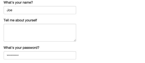
To collect small amounts of text use textInput(); for passwords use passwordInput(); for larger amounts of text, use textAreaInput().
ui <- fluidPage(
  textInput("name", "What's your name?"),
  passwordInput("password", "What's your password?"),
  textAreaInput("story", "Tell me about yourself", rows = 3, cols = 80)
)
If you want to ensure that the text has certain properties you can use validate(), which we’ll come back to in Chapter XYZ.
3.2.3 Numeric inputs
To collect numeric values, you can create a slider with sliderInput(), or a constraind textbox with numericInput(). If you supply a length-2 numeric vector for the default value of sliderInput(), you get a “range” slider that has two ends.
ui <- fluidPage(
  numericInput("num", "Number one", value = 0, min = 0, max = 100),
  sliderInput("num2", "Number two", value = 50, min = 0, max = 100),
  sliderInput("rng", "Range", value = c(10, 20), min = 0, max = 100)
)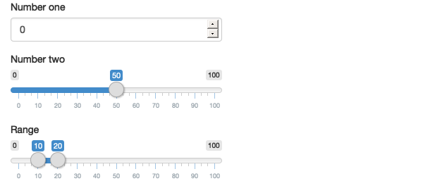
Generally, only use sliders if there’s a relatively small ranges of values, and the precise value is not so important. Attempting to precisely select a number on a slider is an exercise in frustration!
3.2.4 Dates
Dates have two controls that provide a helpful calendar picker, and ensure that the user picks a valid date.
ui <- fluidPage(
  dateInput("dob", "When were you born?"),
  dateRangeInput("holdiay", "When do you want to go on vacation next?")
)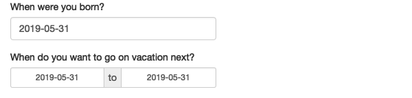
You’ll typically also want to consider setting format, language, and weekstart to make sure that the dates appear in a natural way to your users.
3.2.5 Limited choices
If you want the user to choose from a prespecified set of options, there are two main options: selectInput() and radioButtons().
animals <- c("dog", "cat", "mouse", "bird", "other", "I hate animals")

ui <- fluidPage(
  selectInput("state", "What's your favourite state?", state.name),
  radioButtons("animal", "What's your favourite animal?", animals)
)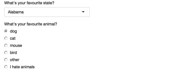
Radio buttons have two advantages. Firstly, they show all possible options, making them most suitable for short lists. Through the choiceNames/choiceValues parameters they can be arbitrary HTML:
ui <- fluidPage(
  radioButtons("rb", "Choose one:",
    choiceNames = list(
      icon("angry"),
      icon("smile"),
      icon("sad-tear")
    ),
    choiceValues = list("angry", "happy", "sad")
  )
)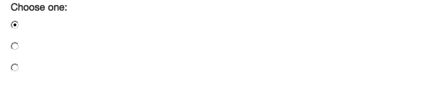
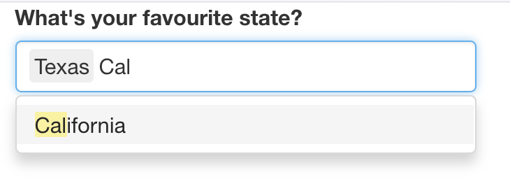
The primary advantage of selectInput() is that it doesn’t show all options at once, making it more suitable for longer options. You can also set multiple = TRUE to allow multiple selections
ui <- fluidPage(
  selectInput(
    "state", "What's your favourite state?", state.name,
    multiple = TRUE
  )
)
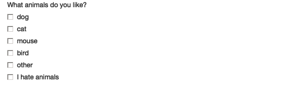
The equivalent to a multi-select radioButtons() is checkboxInputGroup():
ui <- fluidPage(
  checkboxGroupInput("animal", "What animals do you like?", animals)
)
3.2.6 Yes/no questions
To retrieve the answer to a single yes/no question, use checkboxInput():
ui <- fluidPage(
  checkboxInput("cleanup", "Clean up?")
)
3.3 Outputs
Output functions are used to tell Shiny where and how to place outputs that are defined in the app’s server. Like inputs, outputs take a unique ID as their first argument, and are paired with server code. Outputs generally start out as empty rectangles and need to be fed data from the server in order to actually appear.
Outputs have few arguments because, by and large, they just create recepticles for output. We’ll show you the main output functions below, along with the render functions that they’re usually coupled with.
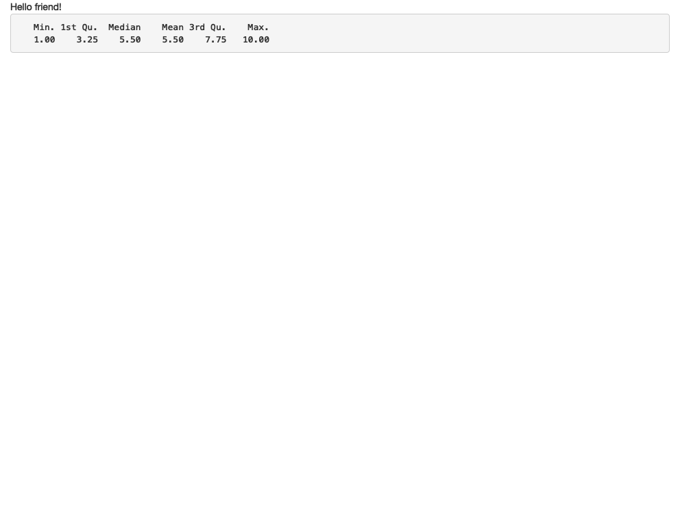
3.3.1 Text
Output regular text with textOutput(), and code with verbatimTextOutput(). On the server side they are coupled with renderText() which displays text returned by the code and renderPrint() which displays any text printed by the code.
ui <- fluidPage(
  textOutput("text"),
  verbatimTextOutput("code")
)
server <- function(input, output, session) {
  output$text <- renderText("Hello friend!")
  output$code <- renderPrint(summary(1:10))
}
3.3.2 Tables
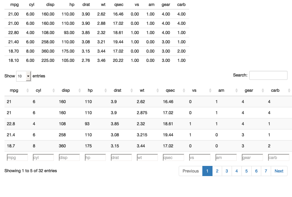
Two options built in to shiny. tableOutput() and renderTable() render a static table of data. All the data is shown. dataTableOutput() and renderDataTable() render a dynamic table, suitable for any size of dataset. The data is dynamically sent from the server as needed.
ui <- fluidPage(
  tableOutput("static"),
  dataTableOutput("dynamic")
)
server <- function(input, output, session) {
  output$static <- renderTable(head(mtcars))
  output$dynamic <- renderDataTable(mtcars, options = list(pageLength = 5))
}
3.3.3 Plots
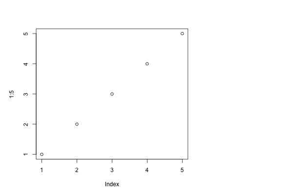
Display R graphics (base and ggplot2) with plotOutput() and renderPlot():
ui <- fluidPage(
  plotOutput("plot", width = "400px")
)
server <- function(input, output, session) {
  output$plot <- renderPlot(plot(1:5))
}
plotOutput() has a number of arguments like click, dblclick, and hover. If you pass these a string, click = "plot_click", they’ll create a reactive output that you can use to handle user events. More on that in Chapter XYZ.
3.4 Layouts
Shiny includes several classes of UI functions that are used to layout inputs and outputs within the app. This chapter focuses on the built-in components centered around fluidPage() and fixedPage() as these provide the structure seen in the most common style of shiny apps. In future chapters you’ll learn about other layout families like dashboards and dialog boxes.
Layouts are composed hierarchically. When you see code like this:
fluidPage(
  titlePanel("Hello Shiny!"),
  sidebarLayout(
    sidebarPanel(
      sliderInput("obs", "Observations:", min = 0, max = 1000, value = 500)
    ),
    mainPanel(
      plotOutput("distPlot")
    )
  )
)
First skim it by focusing on the hierarchy of the function calls:
fluidPage(
  titlePanel(),
  sidebarLayout(
    sidebarPanel(
      sliderInput("obs")
    ),
    mainPanel(
      plotOutput("distPlot")
    )
  )
)
Even without knowing anying about the layout functions you can read the function names to guess what this app is going to look like. You can imagine that this is going to generate a classic website design: a title bar at top, followed by a sidebar (containing a slider) and a main panel containing a plot.
3.4.1 Page functions
The first layout function you’ll encounter in the UI is a page function. Page functions don’t do anything by themselves, but set up the HTML, CSS, and JS that the page needs. The most common page function is fluidPage():
fluidPage(..., title = NULL, theme = NULL)fluidPage() sets up your page to use the Bootstrap CSS framework, https://getbootstrap.com. Bootstrap provides your web page with attractive settings for typography and spacing, and also preloads dozens of CSS rules that can be invoked to visually organize and enhance specific areas of your UI. We’ll take advantage of quite a few of these Bootstrap rules as we proceed through this chapter.
The “fluid” in fluidPage means the page’s content may resize its width (but not height) as the size of the browser window changes. The other option is fixedPage(), which means the page contents will never exceed 960 pixels in width.
Technically, this is all you need: you can put inputs and outputs directly inside fluidPage():
fluidPage(
  sliderInput("min", "Limit (minimum)", min = 0, max = 100, value = 50),
  plotOutput("distPlot")
)
This is fine for very simple examples, but if you want your app to look good, you’ll need to use more layout functions to define the basic structure of the app. Here I’ll introduce you to two common structures: a page with sidebars, and a multirow app.
3.4.3 Under the hood
All web pages are constructed out of HTML, and Shiny user interfaces are no different—although they are generally expressed using R, their ultimate job is to produce HTML. As a Shiny app author, you can use high-level layout functions in R that keep you far away from the details of HTML. You can also work with HTML tags directly to achieve any level of customization you want. These approaches are by no means exclusive; you can mix high-level functions with low-level HTML as much as you like.
while Chapter 5 will delve into using lower-level features for authoring HTML directly.
They’re just functions that return HTML.
fluidPage()<div class="container-fluid"></div>So if you notice a common pattern in your apps you can easily construct your own function. Producing with inputs and outputs is a little trickier in a function because of the need for unique IDs. Fixing this problem is the motivation for Shiny modules, which we’ll come back to in Chapter XYZ.
3.5 Common styles
3.5.1 Page with sidebar
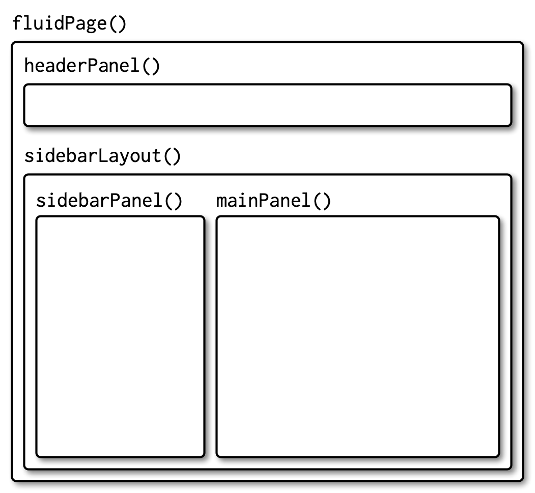
A great structure for simple shiny apps is a two-column layout where the interactive controls appear in a sidebar on the left, and the results appear in the right. This is easy to construct with sidebarLayout() and friends. The basic code structure looks like this:
fluidPage(
  headerPanel(
    # app title/description
  ),
  sidebarLayout(
    sidebarPanel(
      # inputs
    ),
    mainPanel(
      # outputs
    )
  )
)
And generates an app with this basic structure:
3.5.2 Multi-row
You’ll need greater flexibilty for more complex apps, and the next step up in complexity in the multirow layout. This is defined by any number of fluidRow() calls, each of which contains one or more column()s. The basic structure looks like this:
fluidPage(
  fluidRow(
    column(4,
      ...
    ),
    column(8,
      ...
    )
  ),
  fluidRow(
    column(6,
      ...
    ),
    column(6,
      ...
    )
  )
)
which generates a layout like this:
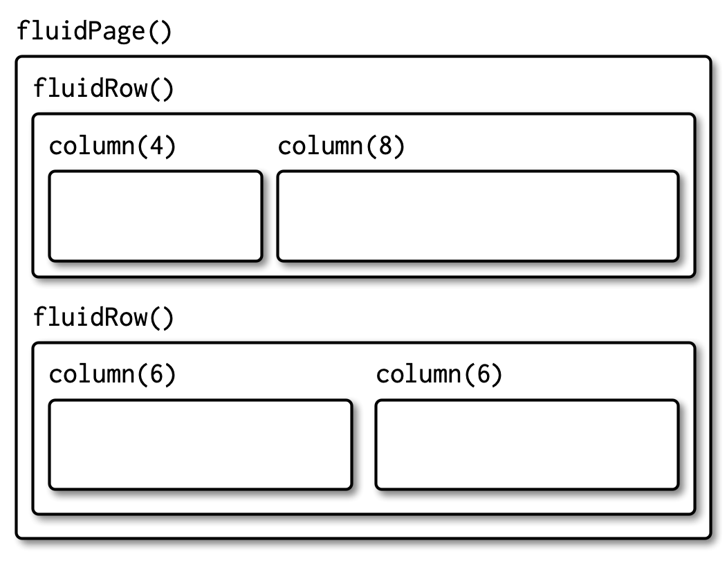
Column widths must add up to 12, but this still gives you substantial flexibility. You can easily create 2-, 3-, or 4- column layouts (more than that starts to get cramped), or sidebars that are narrower or wider than the default in sidebarLayout().
3.5.3 Dashboard
http://rstudio.github.io/shinydashboard/structure.html#layouts